Shop
DreamUp AI Art
DreamUp
Join
Log In
User Menu
Upgrade to Core
Theme
Display Mature Content
Suppress AI Content
Get Help and Send Feedback
Terms of Service
Privacy Policy
Submit
Deviation
Submit your art
Upload your creations for people to see, favourite, and share.
DreamUp
Turn your dreams into reality
Generate your own AI work.
Status Update
Post an update
Tell the community what’s on your mind.
Journal
Post a journal
Share your thoughts, experiences, and stories behind the art.
Literature
Submit your writing
Upload stories, poems, character descriptions & more.
Subscription
Get your fans' support
Fund your creativity by creating subscription tiers.
prings on DeviantArt
https://www.deviantart.com/prings/art/Jet-Black-Social-Media-Icons-185831634
prings
Deviation Actions
Add to Favourites
Comment
4
Favourites
Make the first offer!
BiosOneiros 0030
MetshaCollective
$50
Starting offer
Buy Exclusive
More by
prings
Watch
prings on DeviantArt
https://www.deviantart.com/prings/art/Reppin-Iphone-App-187082054
prings
Suggested Deviants
digitaldelightz
Watch
digitaldelightz on DeviantArt
digitaldelightz on DeviantArt
digitaldelightz on DeviantArt
Esherymack
Watch
Esherymack on DeviantArt
http://creativecommons.org/licenses/by-nc-nd/3.0/
https://www.deviantart.com/esherymack/art/celebration-724394141
Esherymack
Esherymack on DeviantArt
http://creativecommons.org/licenses/by-nc-nd/3.0/
https://www.deviantart.com/esherymack/art/keep-a-weather-eye-on-the-horizon-843290560
Esherymack
Esherymack on DeviantArt
http://creativecommons.org/licenses/by-nc-nd/3.0/
https://www.deviantart.com/esherymack/art/Spare-Me-Over-814756270
Esherymack
Suggested Collections
Mias and Elias
StressedJenny on DeviantArt
https://www.deviantart.com/stressedjenny/art/Mias-and-Elle-Chapter-7-Page-12-854931696
StressedJenny
StressedJenny on DeviantArt
https://www.deviantart.com/stressedjenny/art/Mias-and-Elle-Chapter2-pg23-631852073
StressedJenny
StressedJenny on DeviantArt
https://www.deviantart.com/stressedjenny/art/Mias-and-Elle-Chapter-7-Page-06-844825341
StressedJenny
Mias And Elle
StressedJenny on DeviantArt
https://www.deviantart.com/stressedjenny/art/Mias-and-Elle-Chapter-7-Page-22-862428839
StressedJenny
StressedJenny on DeviantArt
https://www.deviantart.com/stressedjenny/art/Mias-and-Elle-Chapter-7-Page-17-857853431
StressedJenny
StressedJenny on DeviantArt
https://www.deviantart.com/stressedjenny/art/Mias-and-Elle-Chapter-7-Page-13-855358927
StressedJenny
Mias and Elle
StressedJenny on DeviantArt
https://www.deviantart.com/stressedjenny/art/Mias-and-Elle-Chapter-6-Page-29-831823283
StressedJenny
StressedJenny on DeviantArt
https://www.deviantart.com/stressedjenny/art/Mias-and-Elle-Chapter1-pg37-586829941
StressedJenny
StressedJenny on DeviantArt
https://www.deviantart.com/stressedjenny/art/Mias-and-Elle-Chapter-6-Page-32-833958426
StressedJenny
You Might Like…
DVAULTZ on DeviantArt
GLO-HE on DeviantArt
https://www.deviantart.com/glo-he/art/Spiral-Space-309619394
GLO-HE
FractalAtlas on DeviantArt
https://www.deviantart.com/fractalatlas/art/Ear-879290534
FractalAtlas
illtrytobeapro on DeviantArt
http://creativecommons.org/licenses/by-nc-nd/3.0/
https://www.deviantart.com/illtrytobeapro/art/Batik-Gnarls-159045315
illtrytobeapro
AkuraPare on DeviantArt
https://www.deviantart.com/akurapare/art/BiPolar-Portal-344315445
AkuraPare
GUY-D on DeviantArt
https://www.deviantart.com/guy-d/art/GDART-1000295328
GUY-D
digitaldelightz on DeviantArt
surrealistlady on DeviantArt
Senzune on DeviantArt
https://www.deviantart.com/senzune/art/Progesterone-727812355
Senzune
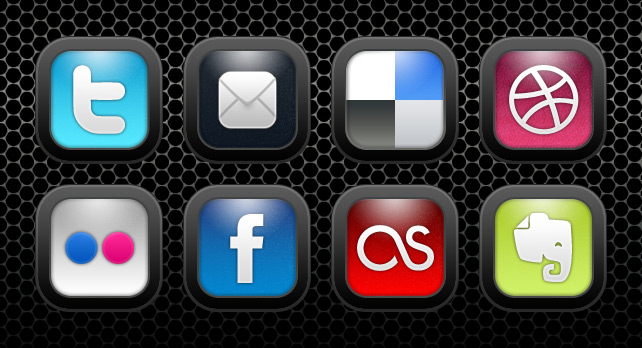
Jet Black Social Media Icons
By
prings
Watch
Published:
Nov 11, 2010
11
Favourites
6
Comments
5.6K
Views
Description
Designed a social media icon set. 30 icons all together.
You can download them for free here
[link]
Image size
642x348px 82.37 KB
© 2010 - 2024
prings
Comments
6
Join the community
to add your comment. Already a deviant?
Log In
CloverWoodss
Aug 18, 2011
Love um, but no formspring? I can't find a single one with it XD
Reply
Load more